June 15 – 26 Daily Creates
This week, the main focus was multimedia and data visualization. Although there wasn’t any data visualization tasks on the TDC website, we were prompted to experiment and play around with different tools available to us. After playing around with different platforms, I can describe how these different activities relate to multimedia principles.
#1: Chat GPT Bar Chart
After thinking about how we can visualize data, one of my favourite ways to view data is through graphs and charts. I wanted to see if I could use AI to produce a simple bar chart. It was really easy to use, as I simply gave ChatGPT the prompt, “make me a bar chart showing people who like apples, bananas, and strawberries, using made up data”. In seconds, the following chart was produced.
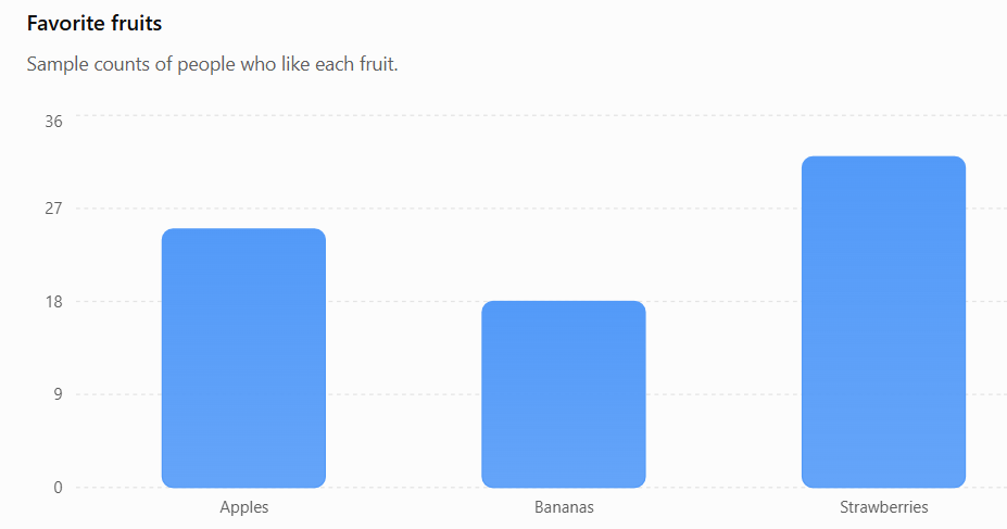
Firstly, the spatial contiguity principle is used here. Labels are placed right below the bars, making it easy for individuals to comprehend how the data is assigned to the category. Additionally, the signalling principle is at play, due to the bright colour blue used on the bars, as well as the faint dashed lines used to mark each count. Both factors act as visual ques so important factors or data stands out.
#2: Instagram Story Poll
After seeing another classmate try this to demonstrate data visualization, I thought it was an awesome idea and wanted to try it out myself! Using Instagram stories, I created a simple poll to track what people’s favourite fruits were. Below are the results.
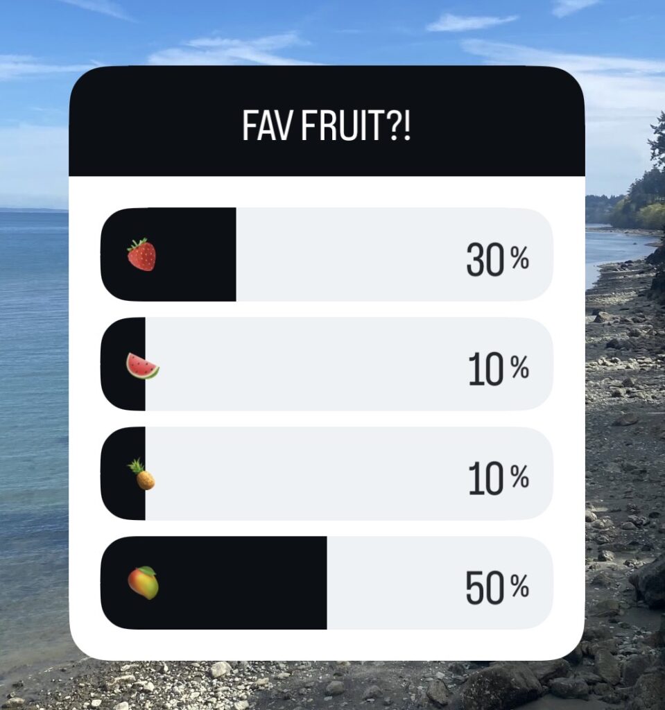
I really like how interactive this data visualization format was. Not only is it easy for people to understand and use, but it is also really easy to see the results, both as a creator and viewer. This explains the interactivity principle; meaning that instead of passively absorbing information, individuals have the opportunity to engage and interact with the media via the platform. I also think that this activity is related to the dual-coding theory, due to the combination of text and images (emojis) presented within the poll. Using two pathways increases overall understanding and information processing.
#3: Interactive Dashboard Example
For this idea, I wanted to find an example of an interactive dashboard. Within the corporate world, dashboards are used to mark productivity, display statistics, visualize projects, and so much more. Specifically in health informatics (my major), they are utilized frequently.
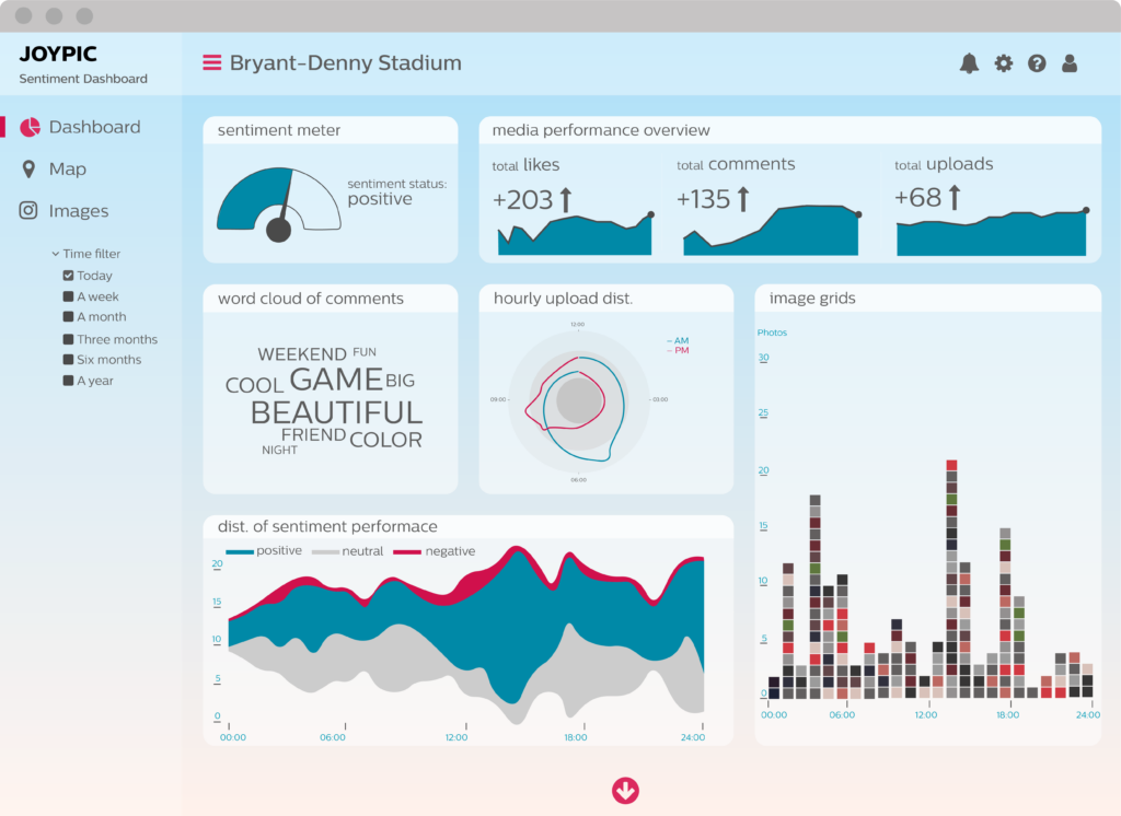
I noticed a few of Mayer’s principles within this image. First was the use of redundancy. Limiting how many times a metric is displayed reduces confusion and visual overwhelm. I also noticed that the signalling principle was heavily present within this example. Colours, arrows, and headings highlight critically important information, drawing your eye to those diagrams. Coherence is present as well, due to the limitation of redundant metrics. On dashboards, only the most important or prioritized visuals are displayed, to optimize efficiency. Lastly, the dual coding theory is demonstrated through the combination of words and images. The interaction between the two channels increases the chance of information being retained in long term memory.